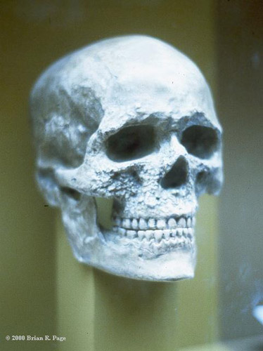
Have you ever heard of the terms " Homo Sapiens" ? Not yet? Well, this is the science name for the fossils of modern humans! This is a picture of a skull from the California Academy of Sciences in 1983 by Brian R Page Caption. It's called : SKULLHOMOSAPIEN. This first pic will let you know that this is a fossil in the show room :

However, I wanna give you another interesting show of this "skull" with Photoshop!
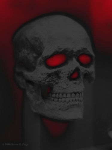
1. Voldemort :
The original pic was edit in Photoshop :
Glow size : -13
Glow Brightness: 31
Color: Red
 I have tried to creat a monster with the original skull, then I found that the Neon Glow Filter can help me in this part! It makes my skull look Scary and Mysterious! This reminds me of a character in the famous HARRY POTTER : Voldemort ( The most evil witch of ever!) Haha, I love to illustrate his appearance! Do ya think that he might be like this?
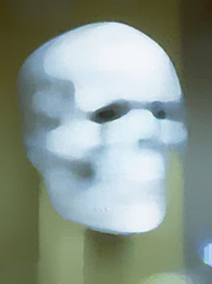
2. Sadness :
With a bit changing : Paint Daubs Filter
Sharpness: 10
Brush Type: Wide Blurry
 This is a very good example for an ABSTRACT IMAGE! It's no longer a skull! Why did I call it SADNESS? Because I found a sad sight in the black holes that seems to be the eyes of a man! Moreover, I feel a slight sigh in his mood! Do you explore that???
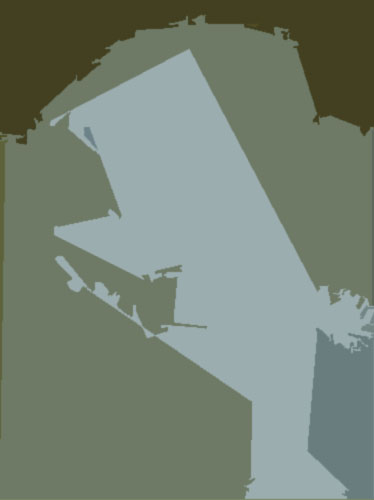
3. Hey, Lady! :
Now, the skull is not there any longer! This is because of the :
Number Levels: 4
Edge Simplicity : 10
Edge Fidelity : 2

Hey, Do you find it same as the shape of a lady? My god, look at her earing! I like it, hihi!
Hey Melanie, abt the second pic with the white sad face, my thinking is exactly as yours...hehe ^^ for the third pic, I cannot see a woman out of it, instead, it reminds me of a guy from the Flintstones - Fred. It looks like he was sinking in his deep thinking while chewing a straw or a feather in his mouth!!! ^_^
Good job Melanie ^^
Picture 1: The colors here are great! Very dark and spooky. It would be even scarier if the the contrast was up a notched so the red would really glow.
Picture 2: I really like how you played with the texture and softened it to the point of looking like smooth plaster. There is a hint of resignation... very nice.
Picture 3: Such interesting shapes and edges. The color pallette works well here, subtle but with enough contrast.


I also like the 1st pic.. it looks GREAT! It make people look at it, die staring at it and scream ^.^ partly, the combination of red and black color builds the horribleness of the image!
The last pic is quietly intersting as its color and shapes! It's one of the models of abstract art, I think!
Good work! Continue, girl ;)