ILLUSION ART - Part 3
OCTAVIO OCAMPO
As Illusion Art has many types, this kind of fines art has attracted me since I was still in highschool. And one of the most typical artist that I admire is Octavio Ocampo. He comes from Mexico, and he was born in 1943 in a family of designers. As you can see in thte following masterpieces, his art is kinda weird, they give you the different thought in every other angle of seeing. Studying about these picture, you can easily admit that mr Octavio is really a talent with the "special eyes" to connect things together in a picture. Here I introduce you several art works of him:

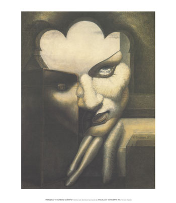
Marlena

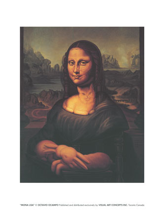
Mona Lisa's Chair
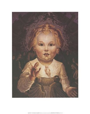
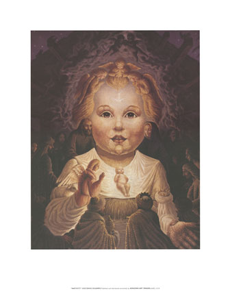
Nativity
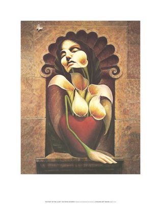
Ecstasy of Lilies
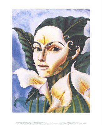
Lady in Field of Lilies
These are just several of his masterpieces that I like most. You can read more about this artist as well as some other picture with more information in this webpage :
http://www.questionmark.net/artists/octavio_ocampo/octavio_ocampo.htm