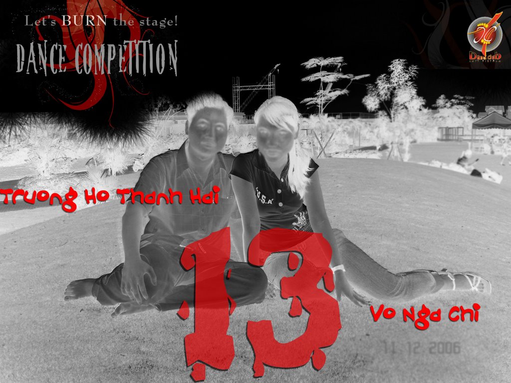
Saturday, December 30, 2006
FATHER AND DAUGHTER (Michael Dudot de Wit)

Well, I watched this film on VTV3 several years ago. When I first watched this, there was a feeling of regret in me though the ending is not quite sad. Uhm, this is the general feeling when you see this film, it's full of feeling, deep thought, etc. that can make you cry easily.


However, What I wanna share to ya here is the debate that I once see on a blog : " Is the love not only waiting?". In the film, you can see that the girl has been waiting for the return of her father for a very long time till the end of the life. Finally, she did go to the dry river to find the truth. THere were 2 ideas, one is that the girl should go and find her dear father from the beginning, that's the love. For the second idea, that she has to be patient to wait for her father for a very long time, it's the love. I myself think that, the love here is both the waiting and the finding of the girl. She can wait for a very long time and she was brave to find the truth, to find her father.
Well, besides the content of the film, I really like the sound of this short film especially the "Blue Danube" song. They really married the animation of the film.
 
posted by Melanie at 6:55 PM | Permalink | 0 comments
DANCE COMPETITION PROMOTING CLIP

Well, this is the clip that I edited for the promoting process of each couple last Dance Competition Event. Uhm, this is not such very professional because I used the iMovie only, next time I'll try the Final Cut HD Pro, it must be better. However, I'm still please with what I got here. This time, I made it faster than I used to, just only 'bout 2 days. :D

Uhm, this is the MP4 file, so it must not be high quality, you can meet me in order to view the full quality one, give me your feedbacks then! THanks


posted by Melanie at 6:29 PM | Permalink | 0 comments
Sunday, December 24, 2006
DESIGN CAMPAIGN OF DANCE COMPETITION II

As you can see around the campus these day, you would see some of our design for the Dance Competition of Dance Club this semester. I am very happy because I and one of my friend has made such a series of design like this. The purpose is to create a repetition of a symbol for the Dance Competition. For this marketing campaign, it's now successful with high attention for this event. And I hope you will attend at the event on this Friday at 5:30pm! Thanks alot!


I. Poster:


II. Table Flyer:


III. Flyer:

IV. Coupon:


V. My pic:

Well, I dont really like to show my face rite there, so, I prefer to create several effects on my pic. Uhm, it looks scary huh? Anyway, plz VOTE for me ! Thanks Alot! Number 13! :P

 
posted by Melanie at 12:07 AM | Permalink | 0 comments
Saturday, December 23, 2006
SHOOTING ACCIDENTALLY


Uhmm, these are several of the fotos that I have shot around our campus. These are just taken randomly with some angle I like or I found them interesting. Take a look at them:


One of the thing I concerned most is the grass at the football field. Overall, they all look smooth, fresh like a carpet. But with the closed shot, they seems to b in a disaster, messy and dying. THis is also because of the light yellow color of the sunset light.


This is the pic that is taken against the sunlight. I took alot of kinda this but this is what I'm pleased with most because the things are toltally unable to b seen except the sun. Actually, at that time, everything are still bright, however the effect of the sunlight make it like this.


And these are : Industrialization vs Natural ???


posted by Melanie at 11:53 PM | Permalink | 1 comments
Saturday, December 16, 2006
WELFARE POSTER

For this assignment, I decided to choose the problem of the transportation originally! But then, when I was on the way to school, there was an idea for the issue of the Prostitution that is a man is hung on a thin wood stick by a small nail. Besides, there was a prostitute who is trying to pull him down toward the HIV virus. I intend to use an image of drawing along the poster. However, the difficulty is that I dont know how to draw a sexy girl! T.T So, my friend sent me this stuff to get an idea : ^^


So, this is my draw. THen, I scan this image onto the computer to edit it by photoshop. I then, change the image into grayscale and I also change the curves to the opposite site to create the possible image.


So, this is my final version of the poster :


posted by Melanie at 5:35 PM | Permalink | 1 comments

WHITE CHRISTMAS POSTER - PART 2


Well, with my last poster, Event Club doesnt like it much because of the sad mood through the poster. THerefore, they required a now version which is more fun and amusing with other funny color! So, I decided to use the image of a Santa Claus combined with the red color in order to indicate what they want. So, this is my final version which I like most.


Together with the new poster design, I also changed the flyer a bit to have this new one with more colors:


posted by Melanie at 5:22 PM | Permalink | 0 comments
Sunday, December 10, 2006
WHITE CHRISTMAS POSTER - PART 1


Well, I was asked to make a poster for the up-coming event of Event Club : White XMas! Originally, they asked me to use only white and red color with the theme of romantic and silent! So, I choose to work with a couples of candles! However, it's not very cool with the candle, so I change my mind to a christmas tree! And, I found the real pine tree with white snow is all that I want for my poster. I like the "sparkle" effects of this poster most, I used to find this effects in many tutorial, then suddenly I found it very easy to do this with the brush and low hardness only! So cute! ^^


Together with the poster is the front and back page of the Flyer. Because they intend to photocopy the flyer, so, I just make them in grayscale with some simple elements of Xmas at the corner.


posted by Melanie at 7:46 AM | Permalink | 0 comments

PHOTOMONTAGE : SELF - PORTRAIT


Well, this is the final masterpiece of my portrait as a machine! Originally, this is a Dancing Machine - because I am now mostly interested in the dance sports (though I'm not really a good dancers! :( ') Uhm, I try to work with as many colors as possible initially, then I found it's quite "ugly", so I decide to use only black and white for grayscale and the RED color for some parts. This was base on the shape of my face in the lower portrait!


posted by Melanie at 6:22 AM | Permalink | 0 comments
Sunday, December 03, 2006
BANNER

This is my design for the banner of Event Club in the Student Diary year 2007. The size is only 17*7cm and this is must be in grayscale. Base on the logo of the Event Club, I have seperate the three separate lines in the banner with the different contents.


posted by Melanie at 12:21 AM | Permalink | 0 comments
LETTERHEAD SYSTEM

This is my design for a letterhead system with a letterhead form, an envelope and a compliment slip. Thess three pieces have the same style of design such as the low opacity logo in the white space to emphasize the symbol of the Sound Hoof Media Group.


1. Letterhead form:


2. Envelope:


3. Compliment Slip:

 
posted by Melanie at 12:05 AM | Permalink | 0 comments
Saturday, December 02, 2006
BUSINESS CARDS

This is the two business cards of the Letterhead system for the Sound Hoof Media Group. In the first version, I make the two black area to create the place for the information of contacts which was changed into White. Then, the Logo and the Name of the president are arranged across the diagonal axis. Overall, this system has a balance for everything, none of the name or the LOgo of the group is stronger.


With this second layout, I try to make it more simple than the first one. The contact information is set up in one column and it is positioning at the opposite corner to the logo. THen, I have changed some of characters into red to be unify with the logo color and style.


posted by Melanie at 11:57 PM | Permalink | 0 comments