Monday, August 07, 2006
CHARITY LOTTERY POSTER
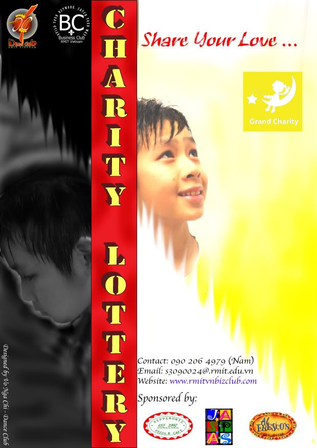
this is the poster that I have designed for the upcoming event : Charity Lottery. At the beginning, I intended to draw somthing using Illustrator. Then, I found that a real photo must be more persuasive, so I thought of the idea using the contrast to show the 2 mood of the orphan children. Therefore, I have to make a photo by myself in order to have right view rather than searching for photo on Google. It is hard to choose the color for the right side of the poster. I have tried with many different colors such as the blue for hope, or white only,etc. Finally, I choose Yellow to be my main theme on the right of the Poster because it would be more contrast to the Black on the left. Moreover, the Red in the middle might make the Poster more recognizable. This is just my own idea, there would a debate on which color is thet best for the theme for this poster. Please feel free to share me your idea on this design. Thank you very much!

Ahhh!!! Too many fonts! The problem is that each logo has its own font as well. So instead of using 3 of your own, you should have limited to just 1 and use it in different sizes.
Watch your spacing. You have not given the "Contact" information much room on the left. It is right up next to the red banner, very little room. The same happens with the "BC" logo at the top, there is barely any room to the right of it. It would be better if all the logos were grouped together.
As an event poster, it should contain some sort of information about what the charity is for, yet there is nothing on the poster to indicate that the charity is for helping orphans. This poster has too many graphical elements and not enough information. Try making the design simpler next time, so you can focus on the message.