Saturday, July 01, 2006
MY 1st POSTER!
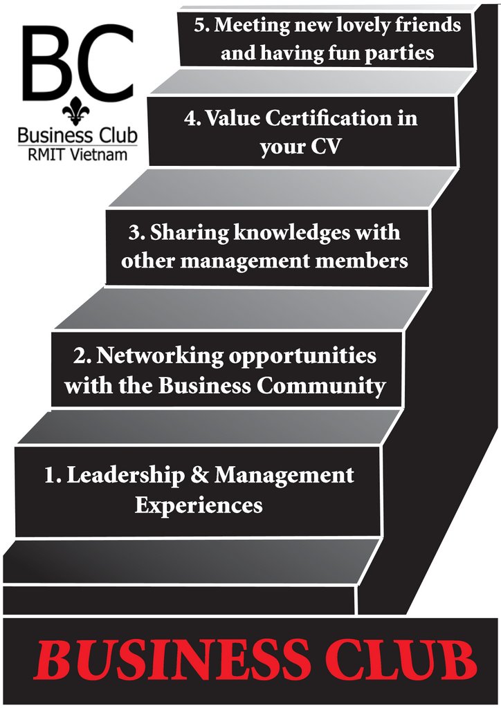
As one of my friend ask me to design a poster for Business Club on the Club Day, I have tried to come up with this 1st draft! I have tried many models, but the only concept impressed me much is the image of a STAIR to illustrate the "benefit" of the Business Club! This will also show an improvement when you join in the Business Club. Hihi, I dont know if they would use this , but I post it here for you to give me comments! Thanks alot!
As one of my friend ask me to design a poster for Business Club on the Club Day, I have tried to come up with this 1st draft! I have tried many models, but the only concept impressed me much is the image of a STAIR to illustrate the "benefit" of the Business Club! This will also show an improvement when you join in the Business Club. Hihi, I dont know if they would use this , but I post it here for you to give me comments! Thanks alot!

Thanks Lien Anh alots for ur comment! Yup, I have to change my poster a bit for a better sight! Obviously, I need to paraphrase those benefits that they give me, so many mistakes, and this is my new poster, plz make a view and comment on it , thanks very much:

posted by Melanie at 5:07 AM | Permalink |
3 Comments:

That looks pretty cool, the color, the idea of staircase, all are awesome. However, I have some suggestion:
a> the height of each staircase should be the same of not too much in difference. By that, it would be more unified. (In that pic, the lowest step and that highest step are not so equal)
b> those text in the box should be right-aligned and the font should be changed also
That's all my comment, hope you'll improve ur work (clap my hands) ^^
Your poster is quietly nice ^.^
However, I recognise that you just use dark color.. Although some words is colored by Red, a hot one, it still looks fairly dark! If the meaning of this poster is to appeal people to join Business club, I think it must be something fresh and bright! It's true that dark colors bring the swanky world. However, to this poster, the brighter it is, the clearer the meaning is!
Anyway, that's your 1st work in Business club, therefore it's so GREAT for a beginner ;)
Keep it up, Chi! Hope to see more works!