Stand in the line and do the same thing with the others??? Even in a community, you still got your own creativity. Being a designer in future, I know that I have to creat my own style and make myself different to anyone else! So, GET OUT OF THE LINE NOW!!!

Finally, what is being URSELF? In my mind, this term means that you have to make yourself to be special with creative thinking and never "plagiarizing" or "imitating" any other styles!
You can be succesful more than any "genious" if you know who you are and use your abilities reasonably and effectively!

This is the post 4 Composition Assignment! Try to make a guess which type of composition that each pic belongs to!!! ^.^
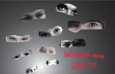
well, the first pic is a bit messy, those images just scattered all over the place, if you can place them based on a specific line such as a wave line or a twirl...etc so it would be nicer, however I like your idea! ^^
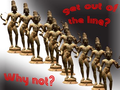
The second pic is ok, nothing to complain ^^ I love it!
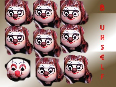
The third pic, if I were you, I would change the text "b urself" into "b different!" cuz it's kind what I get out of this pic but it still depends on our own interpretation anyway! And I love the background, smooth transition and simple! ^^
In the first image, I know that you are trying to illustrate coherence in the, but it does not work very well because there is too much space between the objects. They are just floating in the air, there is not connection. Here the words are not enough to make the image coheasive.
In the second image, you have a established a rhythm, but the words are a bit contradictorary. It questions 'Get out of line?', yet the line is still pretty much intact. If one statue was moved way off to the left side, then the text would make sense and you'd have an image playing with dominance/submission.
The third image is very must like the example in class. What other methods might be used to illustrate dominance/submission?

yep.. I also like the 2nd pic :) so cute and meaningful..
The topic seems to be about "B urseft", rite?
however, I don't think that the typography is good.. maybe using 1 font and 1 color for 3 pics makes them become a unity, but it might create a boredom for viewers..
Your stuff reminds me of some works of Visual Diary in DIM1 ^.^
Good work, Mel!