Wednesday, July 26, 2006
TYPOGRAPHY EXERCISES
This is the 2 layouts that I did for my Typography exercises.
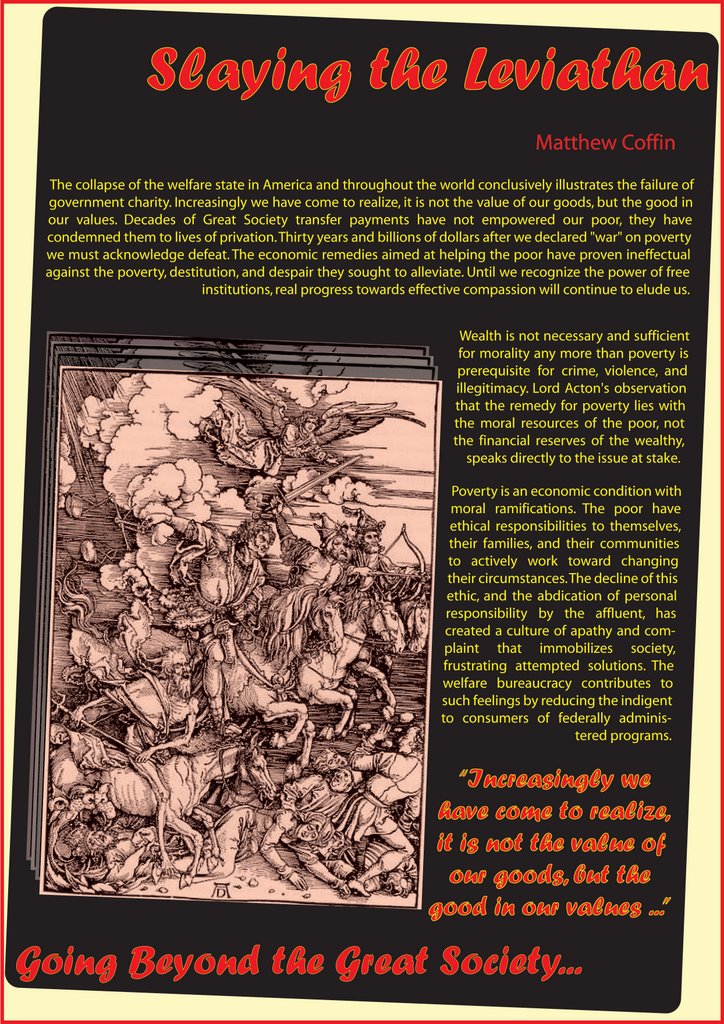
In this first layout, I choose the black background to show the Tragedy mood for the viewer, and together with the black is the red and yellow typography. This is not only to make them easy to be read, but also create a "bloody" thought of the poor destiny and the splendid "yellowish" of the rich.
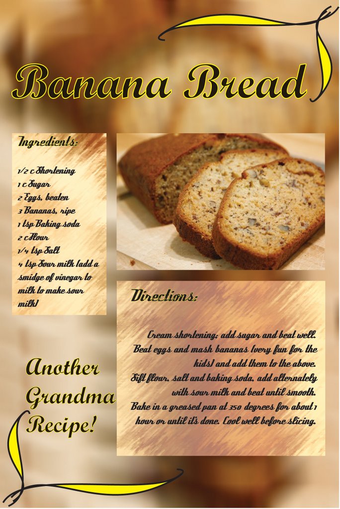
In the layout for Banana Bread, I have added several drawing lines to make the layout less boring. The main theme of color in this layout is Brown and yellow as these are the color of the Bread.

For the first exercise, why have you chosen to "slant" the text? What does this achieve? The bright yellow on the black background is quite hard to read. The yellow stroke outline on the quote is hard to read as well. Actually it reminds me of Halloween, a holiday to celebrate the dead. This article is not really about the dead, but a comment on how the welfare system does not work.
For the second exercise, Banana Bread, I like the repetition that you've created in the background to reflect the image in the foreground. Again, the yellow outline around the text actually makes it harder to read instead of easier.
In the "Banana Bread" exercise, you've also used two decorative text that fight for attention. It is better to use a text that is legible, readable for the ingredients and instructions. After all this is a recipe that someone will be trying to read as they are cooking.
As the for the background behind the "Ingredients" and the "Directions" text, it is too busy and creates a jarring contrast with the other background. It would be better if it is a solid color. Not only will the eyes have a place to rest on the solid color, but it also helps with legibility and readability.