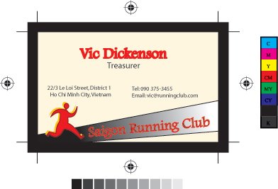
As our exercise this week is to make thte layout of a business card, I have made a card for mr Vic Dickension of Saigon Running Club. I did choose the only black, and red together with a bit white. This is to illustrate the enthusiastic activities in this club.

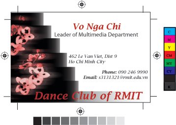
Because I have no real business at the moment, so I designed a card for my recent position as a leader of Multimedia Department of Dance Club. This is made base on the original orchid layout. I have changed this pic a bit to make it more interesting though it is not quite same as the requirements ^.^ Anyway, just give me any comment for this! Thanks alot!

In the first card, the use of the two lines to create a sense of perspective is great! Little things that detract from the design is your alignment for the address. "Ho" in Ho Chi Minh City should line up with the number "22".
Another things is that the "Saigon Running Club" text is hard to read. Do you really need the gradient?
In the second card, the blur of the flowers is interesting, creating a bit of motion. I'm not so crazy about the "Steps" you've created. It makes the card too busy. Another thing that you have to be careful off is your crop marks. Where you have them currently, the bottom half of "Dance Club of RMIT" would be cut off as well as part of the phone number and e-mail address.

Both cards are nice. The first one, i like how u draw two diagonal lines to make a street, simple enough to connote the idea and the purpose of the club.
For the second one, I like the sense of speed and movement in there. However, 3 lines of texts are not really equally spaced. The last one "Phone..." should be spaced a bit lower. And I guess it should be "Dancing Club", not "Dance Club" right? ^^
Good job Mel ^.^