Sunday, November 26, 2006
DISCOUNT CARD

These are several version of the Discount Card for DC that I have designed. With this first version, I really like the back-site, and the color. But the font are still so simple. Moreover, the red is ok on the screen, but when we print it out, it looks awful!


So, I make a new one base on the old design of the front page and change the color a bit. But I do not like this much in general. So I change the color into the yellow one with other design of the front as well as a bit changes with the back.


However, I'm still not very pleased with the last version. It still look quite ok on the screen, but it is not illustrated well with the printing one. So finally, I come up with this perfect version. And as I expect, the printing one is very kool! I like this most! ^^


posted by Melanie at 5:03 AM | Permalink | 0 comments
THE COVER DISK

Well, this is the first time I try to design a cover of disk for a friend of mine. She give me a stickers and her disk to design such an "impressive" disk for her mom! Uhm, I tried with the color pics initially! Though the brown theme is kinda ok, the color of the text is kinda difficult to choose because there are both the light and dark area! Finally, I choose the yellow and red for this one.


However, when I did the back of the cover disk, I found it must be better if I desaturated the color of the pictures and change the color theme into a bit brown as this. Anyway, I prefer the back site more than the front one! ^^


posted by Melanie at 4:37 AM | Permalink | 0 comments
Sunday, November 19, 2006

3 MOCKUPS FOR MY PORTFOLIO


With this layout, I used most of my works such as the photos that I took when I was watching the football match of my friends at the football fields. There are many other interesting photos, but the most attractive pics to me is of the grass. So, I try to make the boder line and the navigators from the grass photos. Originally, I use Black for my font color, but it's only good for the navigators only but not the whole layout. So, I choose the half of brown and yellow color, that is also suitable for the graphics designs also.


This is a layout of the Gallery page. I intend to design about two to four thumbnails of the my works and besides them are the quotes of my explanations or my thought through the works. The "previous" and "next" are the buttons that link to the other page of Gallery parts. There are also the border line to mark the area of the thumbnail. These thumbnails are also the links to a page that shows the full size pics with the full explanation.


This is the final layout of the contact information. On the right side is the avatar in a bit big size. The contact information is put in the center of the page.

 
posted by Melanie at 7:16 AM | Permalink | 1 comments
POSTER FOR HALLOWEEN PARTY


This is a poster that I was asked to design for a camping trip of the University of Social Science & Humanity last Halloween. Though the trip was delayed because of some conflicts, I still post this poster here for you to judge it. Originally, I intended to use Red for the scary scene. Moreover, I chose the font Blood Feast that is only use for Halloween specifically. With this font in red, it is contrast well with the background.

Please take a look at this and give me your opinion then! Thanks so much! ^^


posted by Melanie at 6:50 AM | Permalink | 0 comments
Sunday, November 12, 2006
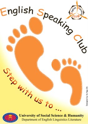
POSTER FOR ESC


This is the final version of the poster that I made for the ESC together with the logo. As they mentioned that most of their activities is to keep people together such as the camping trip, dicussion meeting, etc... So, I choose the idea of using footprints to show the steps of member together with the club. Then, I choose the orange to be the main theme because I want to point out the energy of the ESC member.


posted by Melanie at 8:10 AM | Permalink | 0 comments
LOGO FOR ENGLISH SPEAKING CLUB


This is the 3 designs of a logo I made for the English Speaking Club of the University of Social Science & Humanity. I start up with the 3 ribbon as the cooperation of people in this club. Then, I try to make the logo shape come into triangle. The first one is with border line, and the second has no border. Anyway, when I try to design it in the poster, I found it just same as the Dangerous Sign in transportation. Then, I try to come up with another background which is more suitable! ^^


posted by Melanie at 7:41 AM | Permalink | 1 comments
Sunday, November 05, 2006
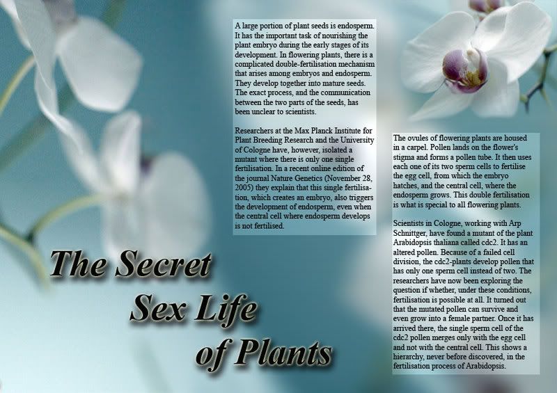
THE SECRET SEX LIFE OF PLANTS


These are the two layers of an scientific paragraph base on the Gestalt Theory.
With the first layout, I chose to work with the picture of orchid because I love orchid. Then, I found it quite hard to arrange the text as well as the image to be suitable. Finally, I have to separate the image into many pieces and set them into the background as this layout.


With this one, I work on the theory of Closure for the flower on the top. Moreover, I also tried the portrait shape of the A4 layout.


posted by Melanie at 7:41 AM | Permalink | 1 comments
SUN AND MOON SYMBOLS

This is several Draft versions of my Sun & Moon Symbols. I have researched several theories of Sun and Moon previously and I have tried to create the new designs of Sun & Moon Symbols base on the changes of the original shapes of the Sun and the Moon. Besides, I still keep several characteristics of the Sun and the Moon such as the spray of the lights around the sun or the waning moon.


I. Sun Symbols:


II. Moon Symbols:


posted by Melanie at 7:24 AM | Permalink | 1 comments